Anglican churches in England differ very much from their Catholic counterparts on the continent of Europe. Whereas Baroque Catholic churches are full of figures and paintings, Anglican churches are stark, no figures, no paintings, no reredos. In some churches calligraphy appears as decoration, sometimes on walls (like in Cerne Abbas) and sometimes framed as pictures (like in the Temple church in London or Chichester Cathedral). Sevenoaks parish church is one example of the latter. There are main prayers there hanged as pictures on walls. They are written in Antigua script, but some words in the beginning are written in a script I call the English Fraktur. They are initials similar to Ludwig Neudorfer style, but not quite the same.
Calligraphy as seen from my bicycle
Calligraphy in old churches and other places as seen during cycling tours around Europe.
Friday, January 9, 2026
Thursday, December 18, 2025
Siena exihibition in London National Gallery
Earlier this year there was an exhibition of painting from Siena that led the way to Renaissance. At least one picture had writing in Lombardic capitals. Can't be seen anymore (at least in London), but I reproduce it here.
Friday, November 14, 2025
Santiago de Compostela
When walking the Santiago de Compostela pilgrimage, you end up in the church of Santiago. There is some interesting calligraphy in the church. One which seems to me Renaissance is incrusted, which means somebody must have written the letters by hand, but later they have been cut out in stone. Seems quite a lot of work. The other is dated 1715, and is engraved in stone.
Wednesday, November 6, 2024
Archivo de las Indias in Seville
The Archivo de las Indias in Seville is a bit like the British Library: it is free to enter and you can see some of the most interesting documents there. Of course all the documents are post-Columbus, as “las Indias” really means America here. The documents are hand-written, one can see the delelopement of document hand. The earliest, like the treaty of Tordesillas of 1494, are written basically in style of mediaeval documents, later documents (some of which are dated) show the developments of later styles.
There are no Neudorfer-style fraktur initials, but in some documents we see clearly Baroque flourishes.
.jpg) |
| The treaty of Tordesillas |
.jpg) |
| The treaty of Tordesillas |
.jpg) |
| Charge against Hernan Cortes, 1533 |
.jpg) |
| Charge against Hernan Cortes, 1533 |
.jpg) |
| Charge against Hernan Cortes, 1533 |
.jpg) |
| Charge against Hernan Cortes, 1533 |
.jpg) |
| Charge against Hernan Cortes, 1533 |
.jpg) |
| Document of 1663 |
.jpg) |
| Document of 1663 |
.jpg) |
| Document of 1665 |
.jpg) |
| Document of 1665 |
.jpg) |
| Document of 1665 |
 |
| Warning about English pirates, 1683 |
 |
| Document of 1744 |
Friday, June 28, 2024
Dominican Museum in Cracow
There is an interesting museum in the cloisters of the Dominican church in Cracow. I mean it is interesting if you are either into history of the Dominicans or into calligraphy. There are some documents pertaining Dominican history here, they are of course mediaeval and written in the best hand. They are examples of official documents hand of the time. The first is so called "passport of st. Jacek", a letter explaining his credentials to whoever may be concerned (he was sent by the pope to organise the Dominican order in Poland). The second, of almost the same date, is the document permitting the Dominicans to build their church in Cracow. The third, a century later, is a document establishing the papal inquisition in Cracow. There also is a missal written for a pope, of course also in the best hand possible. It is an example of texture capitalis quadrata in the best version, although apparently created late for this style.
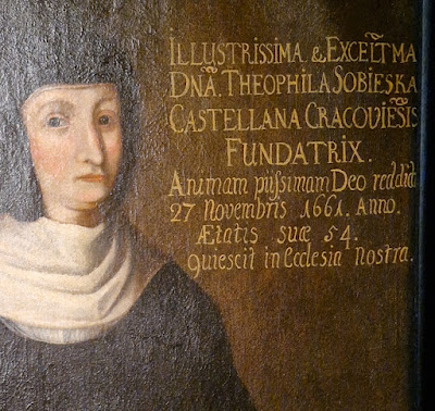
There are also examples of later styles. Apparently in the 17thcentury in Poland there was a custom of writing on the pictures, an information of who is on the picture would be written on it, not always in the best hand but in the style of the times. The styles are capitalis minumentalis with antiqua and also some corsiva, of course written by hand with a brush. They seem to have been written with a relatively wide brush held so that vertical lines would be thicker than the horizontal ones.
I also found a picture from the 19th century with descriptions of what is on the picture in quite a good hand of the time. In fact I wander how it was written there. It appears to be a style of hand writing taught at schools at the time, with a steel nib, which pressed when writing vertical strokes would produce a thicker line. But how it was done on an oil painting?
 |
| "Passport" of St. Jacek (also called St. Hiacynth),1227 |
 |
| Charter of the Dominican monastery in Cracow, 1227 |
 |
| Charter of the papal inquisition in Poland, 1327 |
.jpg) |
| Life of St. Jacek, 1360 |
.jpg) |
| Papal missal, 1570 |
.JPG)
.JPG)
.JPG)
.jpg)
.jpg)
.jpg)
.jpg)
.jpg)
.jpg)
.jpg)
.jpg)
.jpg)
.jpg)
.JPG)
.JPG)
.JPG)
.JPG)
.JPG)
.JPG)
.JPG)


.jpg)
%20-%20Copy.jpg)
.jpg)
.jpg)

.jpg)
.jpg)

.jpg)
.jpg)